February 06, 2004
Good logo!
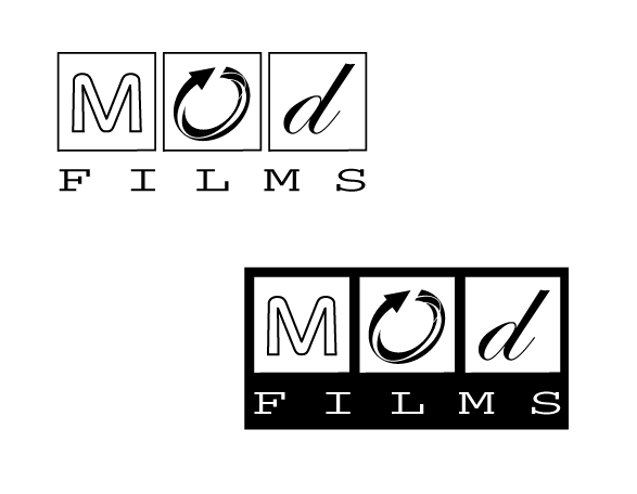
Posted by: Damon at February 10, 2004 11:51 AM>> In my view, the logo is a little too fussy - too many fonts vying for
>> attention!
>
> Thanks. It's a tricky one. I want to get across the sense of
> modularity across different types but yes, it is a little fussy.
I think that the design will also look better without the boxes and still provide a sense of modularity...
Posted by: Mike E at February 10, 2004 11:52 AMLike it. The squares recall the frames of celluloid film & the fonts used convey a sense of the old (tradition), the new (modernity/tech) and the re-useability/sustainability concept.
Who designed it? Let me guess not Myriad!
Im a tad confused, tho. Why are you designing a logo for something that I thought was generic? Ie Why would Mr Hoover design a logo that said Vacuum Cleaner? Have you registered Mod Films as a brand/trademark????
